Logos are the face of a brand. They represent a company’s identity. The most famous logos are instantly recognizable. They evoke emotions and memories. Let’s explore 37 of the world’s most iconic logos. We’ll uncover the lessons they teach us about effective logo design.
The Power of Simplicity
Nike’s Swoosh
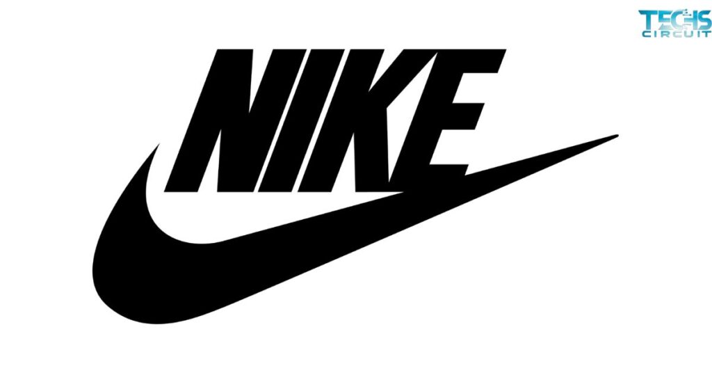
Nike’s swoosh is a masterclass in simplicity. It’s a single curved line. Yet it conveys motion and speed. The swoosh represents the wing of Nike, the Greek goddess of victory. It cost just $35 to design in 1971. Today, it’s worth billions.
Apple’s Bitten Apple
Apple’s logo is another example of simplicity. It’s just an apple with a bite taken out. The bite prevents it from being mistaken for a cherry. It also creates a play on words with “byte”. The logo has barely changed since 1977. It proves that simple designs can stand the test of time.
McDonald’s Golden Arches

McDonald’s golden arches form a simple “M”. They originated from the architecture of early McDonald’s restaurants. The arches are now one of the most recognized symbols worldwide. They show how a simple shape can become a powerful brand asset.
The Art of Hidden Meanings
FedEx’s Arrow
FedEx’s logo hides an arrow in its negative space. It’s between the “E” and “x”. This arrow symbolizes speed and precision. It’s a clever use of space that adds depth to a simple wordmark.
Amazon’s Smile
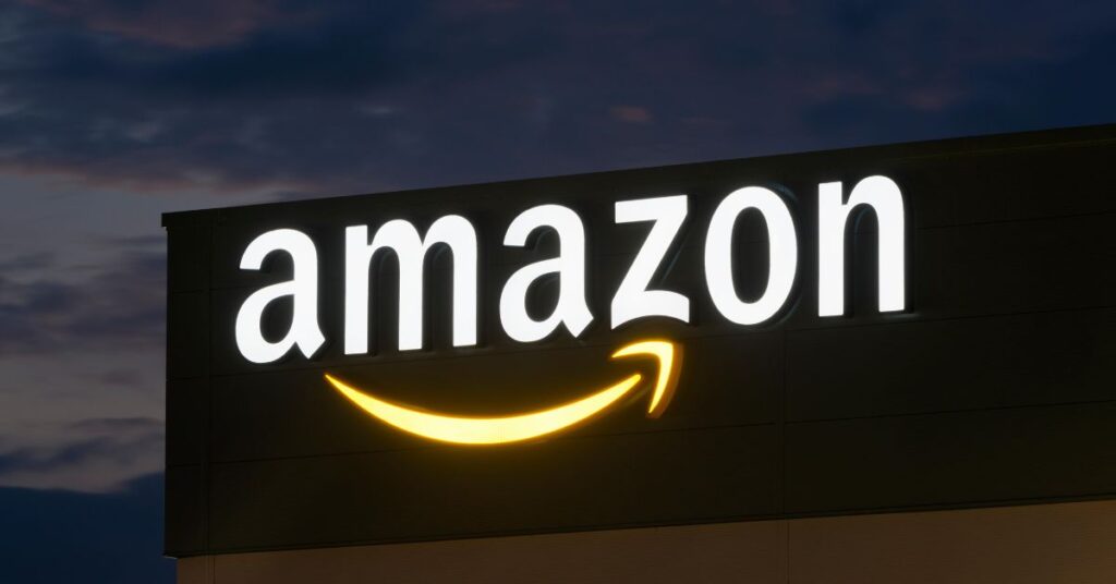
Amazon’s logo features a curved arrow. It points from “A” to “Z”. This suggests they sell everything from A to Z. The arrow also forms a smile. It represents customer satisfaction. It’s a simple yet effective way to convey multiple messages.
Toblerone’s Bear
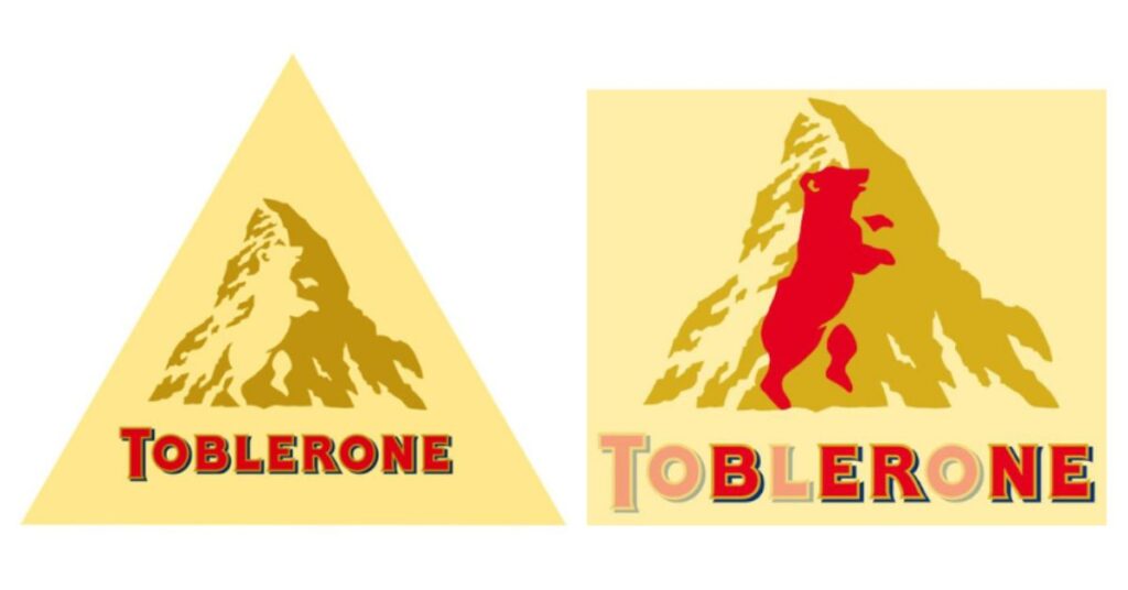
Toblerone’s logo includes the Matterhorn mountain. Hidden in the mountain is the silhouette of a bear. It’s a nod to Bern, Switzerland, where Toblerone originated. This hidden element adds an element of discovery for observant consumers.
The Impact of Color
Coca-Cola’s Red
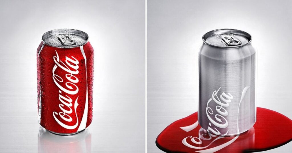
Coca-Cola’s red is instantly recognizable. It’s been part of the brand since the 1890s. Red evokes energy, excitement, and passion. It makes the logo stand out on shelves and in advertisements.
Facebook’s Blue
Facebook chose blue for its logo. Blue represents trust, security, and reliability. It’s a calming color that encourages users to spend time on the platform. The choice of color aligns with Facebook’s goal of connecting people.
Google’s Multicolor
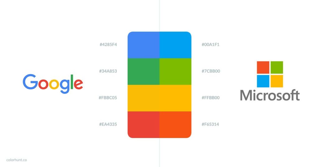
Google’s logo uses all primary colors. Plus green. This playful color scheme represents the company’s innovative spirit. It also makes the logo memorable and child-like in its simplicity.
Lessons from Famous Logos
Here are key takeaways from these iconic logos:
- Keep it simple: The most memorable logos are often the simplest.
- Use hidden meanings: Subtle elements can add depth and interest.
- Choose colors wisely: Colors evoke emotions and should align with brand values.
- Be timeless: Avoid trendy designs that may quickly become outdated.
- Ensure versatility: Logos should work in various sizes and mediums.
Evolution of Iconic Logos
Many famous logos have evolved over time. Here’s a look at some notable changes:
| Brand | Original Logo Year | Latest Update | Major Changes |
| Apple | 1976 | 1998 | From complex illustration to simple apple shape |
| Pepsi | 1898 | 2008 | From script to minimalist circular design |
| Starbucks | 1971 | 2011 | From detailed mermaid to simplified icon |
| Shell | 1900 | 1999 | From realistic shell to stylized icon |
| Microsoft | 1975 | 2012 | From retro text to modern window symbol |
These evolutions show how brands adapt to changing design trends. They maintain their core identity while staying relevant.
The Role of Typography in Logos
Coca-Cola’s Script
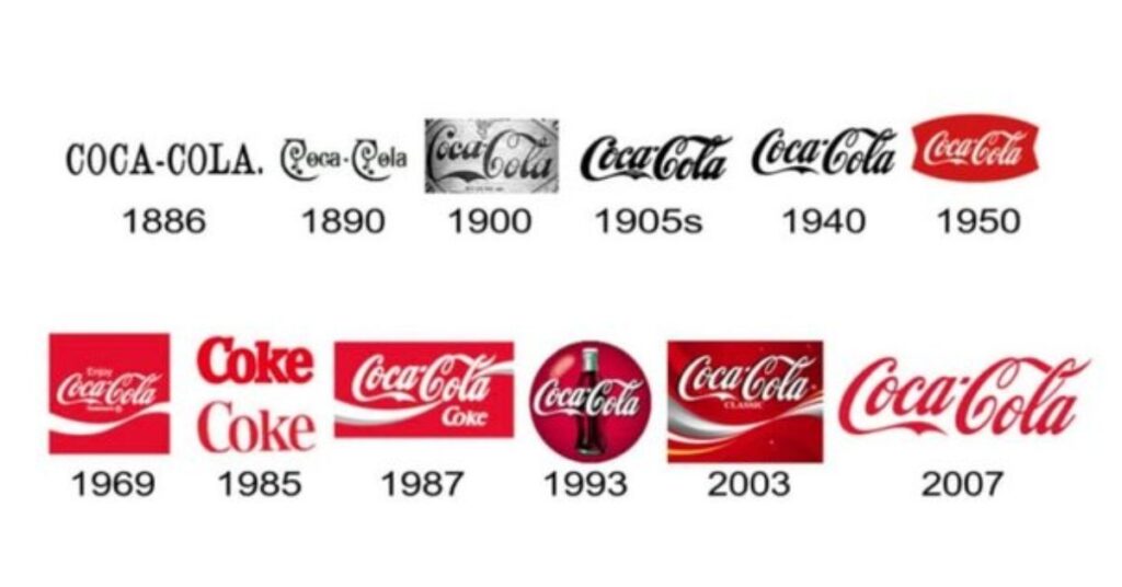
Coca-Cola’s flowing script is a key part of its logo. It’s been largely unchanged since 1887. The script evokes nostalgia and tradition. It’s an excellent example of how typography can become a brand’s signature.
IBM’s Bold Letters
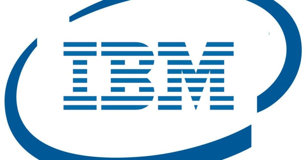
IBM’s logo uses bold, horizontal stripes. These stripes create the letters I, B, and M. The design suggests speed and dynamism. It shows how typography can be manipulated to convey brand attributes.
Disney’s Whimsical Font
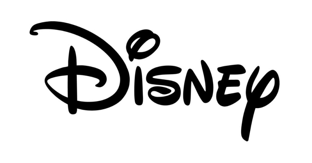
Disney’s logo features a stylized version of Walt Disney’s signature. The playful, flowing script captures the magic and wonder of the Disney brand. It demonstrates how custom typography can embody a brand’s personality.
Logos That Tell a Story
Starbucks’ Siren
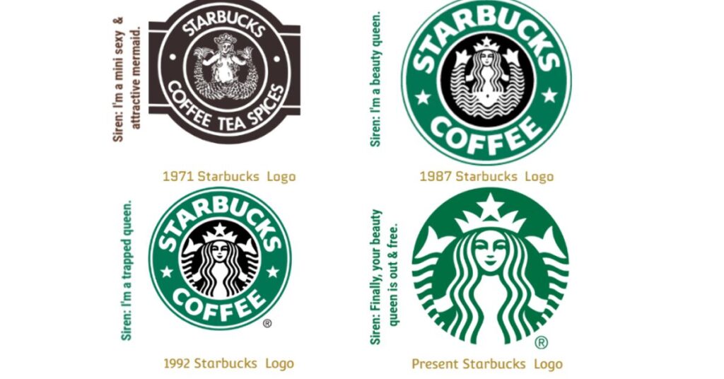
Starbucks’ logo features a twin-tailed mermaid, or siren. It’s inspired by maritime mythology. The siren represents the seductive power of coffee. It tells a story of allure and temptation.
Lacoste’s Crocodile
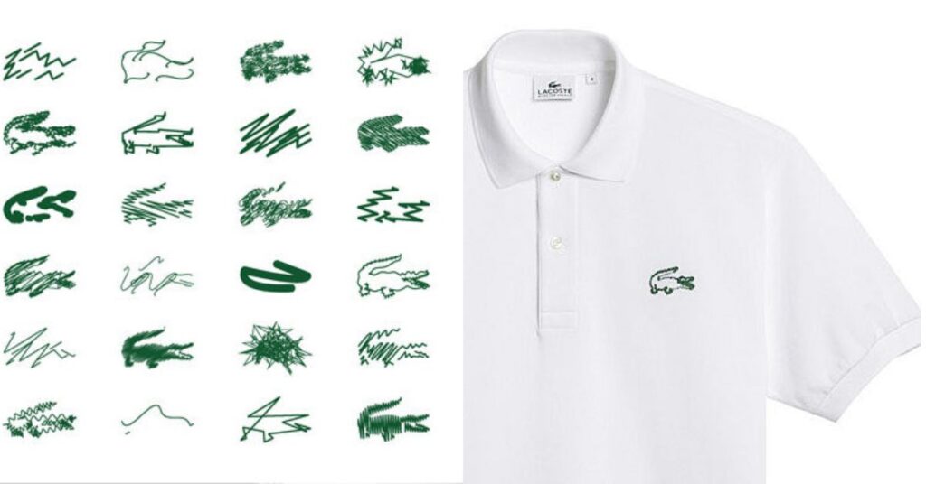
Lacoste’s crocodile logo comes from the founder’s nickname. René Lacoste was called “The Crocodile” for his tenacity on the tennis court. The logo tells a story of the brand’s origins and values.
Playboy’s Bunny
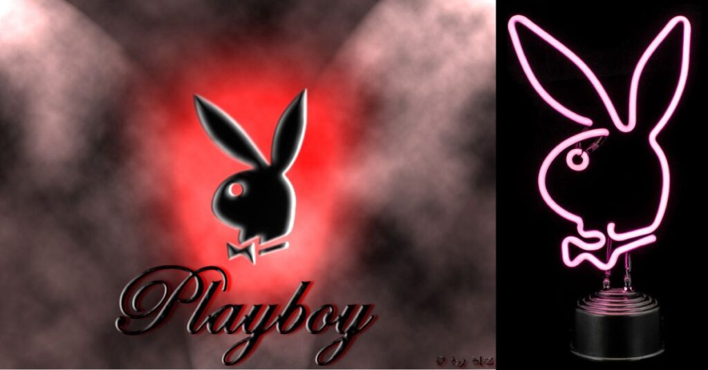
Playboy’s bunny logo is more than just a cute animal. It represents the brand’s playful and sophisticated image. The bunny, with its bowtie, tells a story of luxury and hedonism.
The Importance of Versatility
Target’s Bullseye
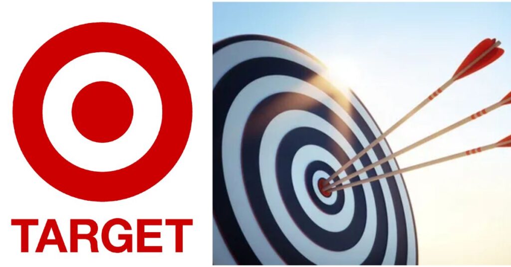
Target’s bullseye logo is simple yet effective. It works well in various sizes and mediums. It’s recognizable even when tiny on a mobile screen. This versatility is crucial in today’s multi-platform world.
Nike’s Swoosh
Nike’s swoosh can stand alone without the brand name. It’s effective on products, advertisements, and digital platforms. This versatility allows for flexible branding across different contexts.
Apple’s Icon
Apple’s logo works in any color. It’s effective in 2D or 3D. This versatility allows it to adapt to different product designs and marketing materials. It’s a key factor in the logo’s longevity.
Logos and Brand Identity
Mercedes-Benz’s Star
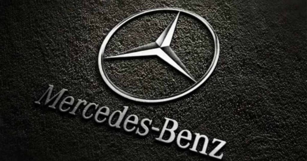
Mercedes-Benz’s three-pointed star represents dominance over land, sea, and air. It embodies the brand’s commitment to universal mobility. The logo is integral to the brand’s premium identity.
WWF’s Panda
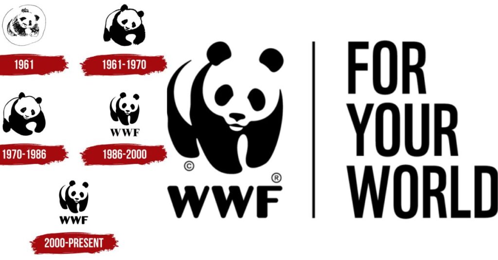
The World Wildlife Fund’s panda logo is more than cute. It represents the organization’s mission to protect endangered species. The black and white design is both striking and economical to print.
Linux’s Penguin

Linux’s penguin logo, named Tux, represents the operating system’s playful side. It contrasts with the serious, corporate image of competitors. The logo helps define Linux’s open-source, community-driven identity.
The Future of Logo Design
Logo design continues to evolve. Here are some trends:
- Responsive logos that adapt to different screen sizes
- Animated logos for digital platforms
- Simplified designs for better recognition on small screens
- Use of gradients and vibrant colors
- Increased focus on sustainability and social responsibility in design
These trends show how logos are adapting to new technologies and changing consumer values.
Famous Logos in Popular Culture
Logos often transcend their original purpose. They become cultural icons. Here are some examples:
- The Rolling Stones’ lips and tongue logo is a symbol of rock ‘n’ roll
- The Batman logo has evolved with each film adaptation
- The “I ❤ NY” logo has been adapted for cities worldwide
- The Peace symbol has been used in various social movements
- The Olympic rings represent global unity through sport
These logos show how powerful symbols can take on broader cultural significance.
Controversial Logo Changes
Not all logo changes are well-received. Some examples:
- Gap’s 2010 logo redesign was scrapped after public backlash
- Tropicana’s 2009 packaging redesign led to a 20% sales drop
- Instagram’s 2016 logo change initially faced criticism but was eventually accepted
- Airbnb’s 2014 logo redesign was mocked for its suggestive shape
- Yahoo’s 2013 logo change after 30 days of teasers was underwhelming to many
These cases highlight the emotional connection people have with familiar logos. They show the risks of rebranding.
The Psychology of Logo Design
Logos tap into human psychology. Some key principles:
- Color psychology: Different colors evoke different emotions
- Shape psychology: Rounded shapes feel friendly, angular shapes feel dynamic
- The Von Restorff effect: Distinctive logos are more memorable
- The Isolation effect: Simple logos are easier to recall
- The Picture superiority effect: Images are remembered better than words
Understanding these principles can lead to more effective logo design.
Must Read This Article:Logo:8rneleok-fk= roblox: The Ultimate Guide
Logos and Brand Loyalty
Strong logos can foster brand loyalty. They become shortcuts for the emotions and experiences associated with a brand. A well-designed logo can:
- Increase brand recognition
- Evoke positive feelings
- Differentiate from competitors
- Communicate brand values
- Create a sense of trust and familiarity
These factors contribute to building lasting relationships with consumers.
The Role of Logos in Marketing
Logos play a crucial role in marketing. They:
- Create first impressions
- Establish brand identity
- Aid in brand recall
- Convey brand personality
- Provide consistency across marketing materials
Effective logos are central to successful marketing strategies.
Legal Aspects of Logo Design
Logo design involves legal considerations:
- Trademark protection is crucial for unique logos
- Logos must not infringe on existing trademarks
- Some elements, like generic shapes, cannot be trademarked
- International trademark laws vary, complicating global branding
- Copyright laws protect the artistic elements of logos
Understanding these legal aspects is essential for protecting brand identity.
DIY vs Professional Logo Design
Many startups consider DIY logo design. However, professional design offers advantages:
- Expertise in design principles and trends
- Understanding of brand strategy
- Knowledge of legal considerations
- Access to professional design tools
- Experience in creating versatile, scalable designs
While DIY can save money initially, professional design often provides better long-term value.
Measuring Logo Effectiveness
How can you tell if a logo is effective? Consider these factors:
- Recognition: Can people identify the brand from the logo alone?
- Recall: Do people remember the logo after seeing it?
- Associations: What feelings or ideas does the logo evoke?
- Flexibility: Does the logo work across various media?
- Longevity: Has the logo remained effective over time?
Regular assessment of these factors can guide logo updates and rebranding efforts.
FAQ’s
What makes a logo iconic?
An iconic logo is simple, memorable, and timeless. It effectively represents the brand’s identity and values. It also tends to have a unique element that sets it apart.
How often should a company update its logo?
There’s no set rule, but most companies update their logos every 7-10 years. However, some iconic logos have remained largely unchanged for decades.
Can a bad logo hurt a business?
Yes, a poorly designed logo can harm a business. It may fail to attract customers, misrepresent the brand, or even offend people unintentionally.
How much does professional logo design cost?
Professional logo design can range from a few hundred dollars to tens of thousands. The cost depends on the designer’s experience and the complexity of the project.
Should a logo include the company name?
Not necessarily. Many successful logos, like Apple’s and Nike’s, don’t include the company name. It depends on the brand’s recognition and marketing strategy.
Conclusion
Logos are powerful tools in branding and marketing. The world’s most famous logos teach valuable lessons about effective design. They show the importance of simplicity, hidden meanings, and color psychology.
These iconic logos have stood the test of time. They’ve adapted to changing trends while maintaining their core identity. By studying these logos, designers and businesses can create more effective brand identities.